Internal alignment - Dashboard shell

The shell direction works.
The responsive rules need to be explicit.

This brief turns the responsive behavior into explicit decisions. Engineering can implement fixed tracks, fluid tracks, or a hybrid once design and product define the expected states across pages and viewport sizes.

June 2026 Merchant dashboard redesign Scope: layout behavior and edge states
01 - Context

What design is proposing

The proposed shell moves the dashboard from a top navigation model to a three-zone layout: a left navigation rail, a center content area, and a right-side task or action rail. The open implementation decision is how the center content grid behaves as available width changes.

Proposed dashboard onboarding screen with left navigation, center task cards, and a right todo rail.
Proposed shell

Onboarding cards in the center area

The first-page example works well at the Figma width: three cards can sit on the first row and the right task rail remains visible.

Proposed dashboard table screen with left navigation, center metrics and table, and a right action rail.
Proposed shell

Metrics and table in the center area

This page has a different content shape: title, four metric cards, and a wide data table. It needs rules beyond a simple card grid.

!

The decision we need to record

Are center-content columns fixed-width tracks, or are they fluid tracks with minimum and maximum widths? Both are implementable. They create different intermediate-width behavior, especially on laptops, tablets, split-screen windows, and zoomed browser sessions.

02 - Decision point

Fixed and fluid tracks create different intermediate states

The main decision is not the left rail or the right rail by themselves. The decision is how the center area should respond when two side rails reduce the available width from the Figma desktop state.

Large desktop: both approaches can look identical

When the center content area is wide enough, three target-width cards fit on the same row. This is the Figma-friendly state where fixed and fluid tracks can be visually indistinguishable.

Card 1target width
Card 2target width
Card 3target width

Smaller screen: fluid tracks shrink first

Cards keep the three-column composition by becoming narrower within the approved range. The breakpoint changes only once the minimum usable card width is reached.

Card 1shrunk
Card 2shrunk
Card 3shrunk

Smaller screen: fixed tracks preserve width and wrap

Cards keep the desktop target width. The third card cannot fit, so it moves to the next row even though there is still visible space on the right.

Card 1target width
Card 2target width
Card 3target width
Important nuance: the leftover space is visible, but still smaller than one fixed card.

That is why the card wraps: if the leftover area were as wide as a card, the browser would place the card there.

With more cards, the same rule can produce single-card rows

For a five-card section, the fixed-width behavior can become two cards, two cards, then one card. The state to decide is the repeated intermediate-width behavior, not one exact pixel value.

Card 1target width
Card 2target width
Card 3target width
Card 4target width
Card 5target width
State to decide: the right side can feel empty even though it is not large enough to fit another fixed-width card.
03 - Stripe reference

What the Stripe screenshots show

Stripe is useful as a reference because it appears to preserve the grid while allowing card widths to respond to the available viewport. A fixed-width simulation creates a different visual outcome at the same kind of intermediate width.

Stripe overview screen where three cards fit across by shrinking with the available width.
Current Stripe behavior

Cards are narrower at this viewport

The cards are not the same width they would be on a large desktop. They flex with the window, keeping the row useful until a real breakpoint is needed.

Stripe overview screen simulated with fixed-width cards, causing two cards per row and a large blank area on the right.
Fixed-width simulation

The row wraps before another card can fit

The card width stays stable, so the third card drops. The Add and Edit buttons remain on the far right, above visible space that is still narrower than a fixed-width card.

Choice What it optimizes for Responsive cost Decision needed
Fluid tracks Fewer awkward intermediate widths; center area keeps using available space. Cards need acceptable min and max widths. Content must tolerate some horizontal compression. Define min width, max width, gutter, and breakpoint where 3-up becomes 2-up.
Fixed tracks Stable card dimensions and easier visual comparison at the exact same component width. Earlier wrapping, possible single-card rows, and visible unused space beside the content. Confirm whether 2+2+1 or 3+1 layouts and right-side blank space are acceptable states.
04 - Beyond one card cluster

The system must also describe tables, headers, detail panels, and mobile cards

The redesign goal is consistency across dashboards. That means the grid rules need to work for pages that are not just a variable number of equal cards.

Metrics + table page

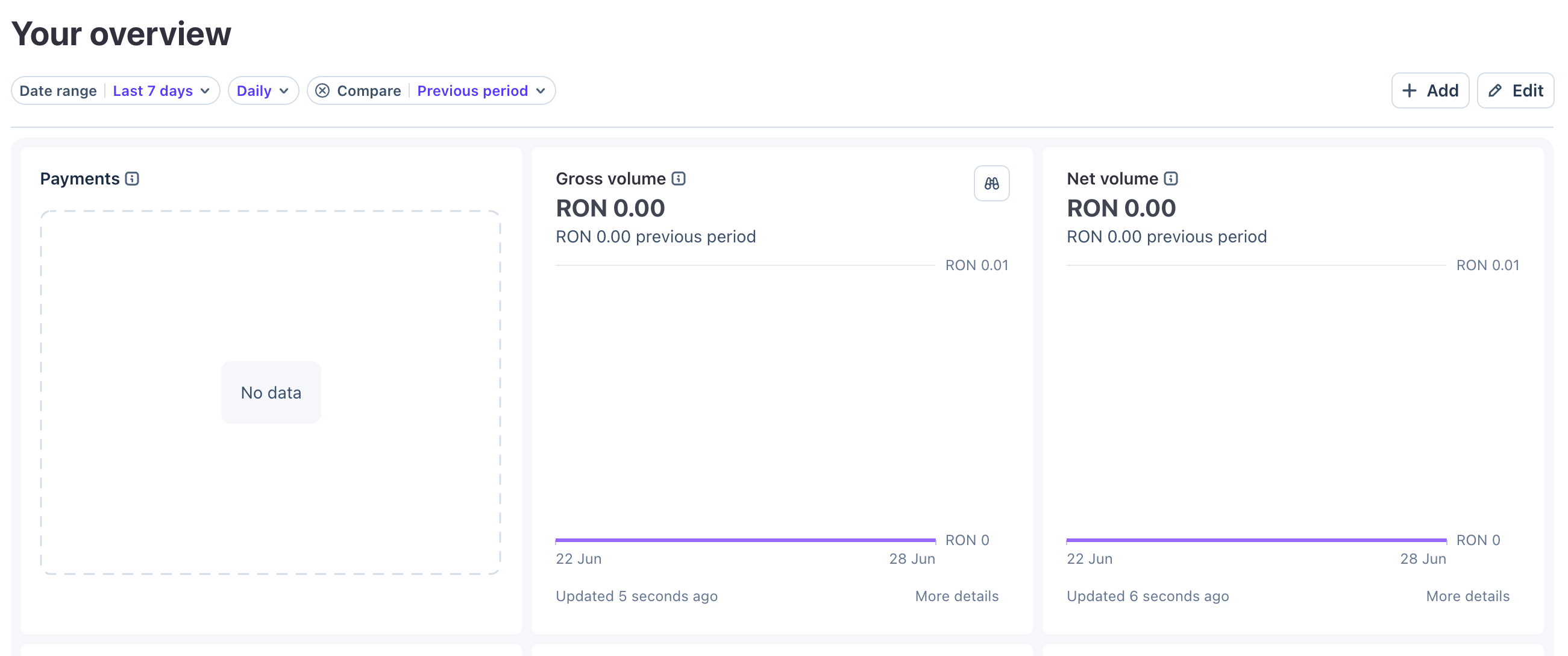
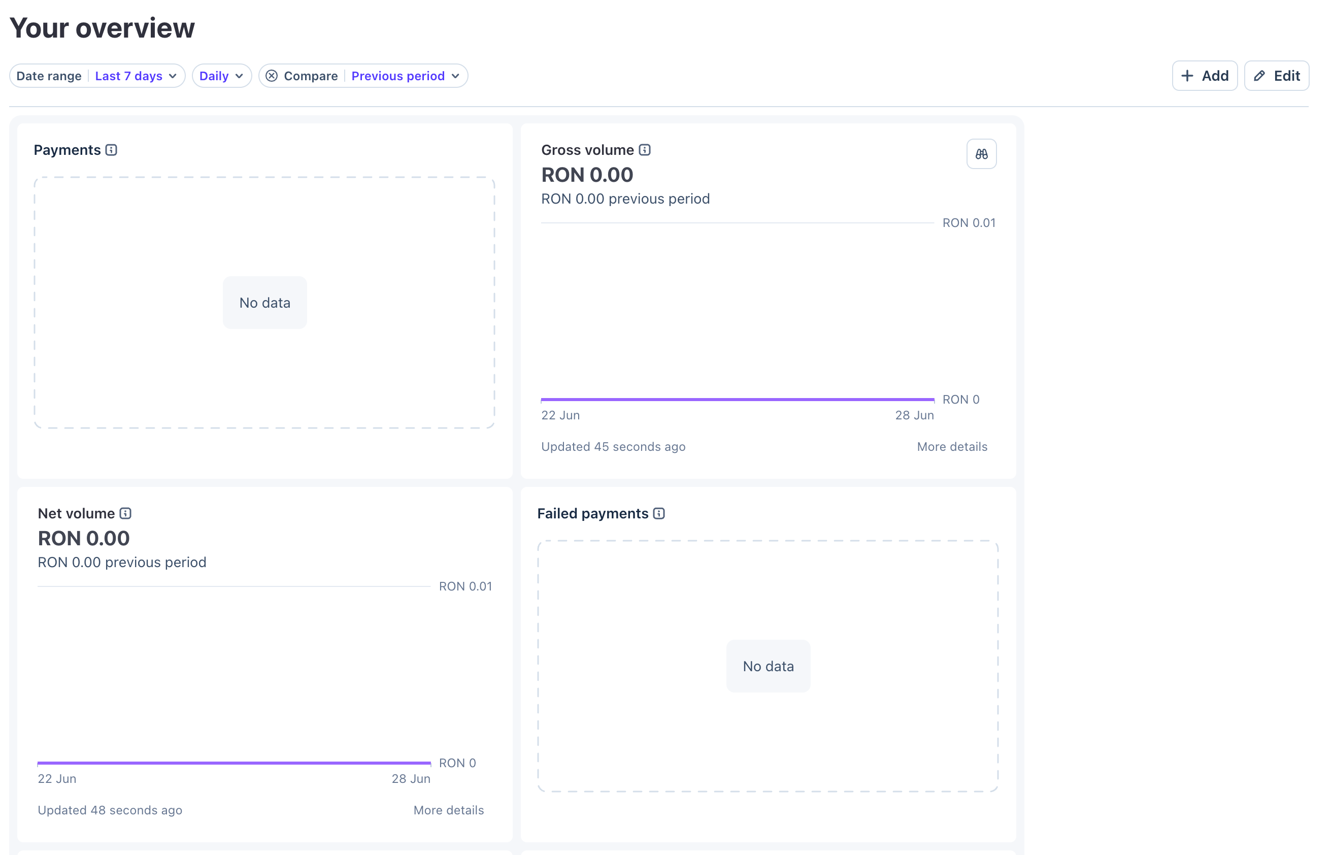
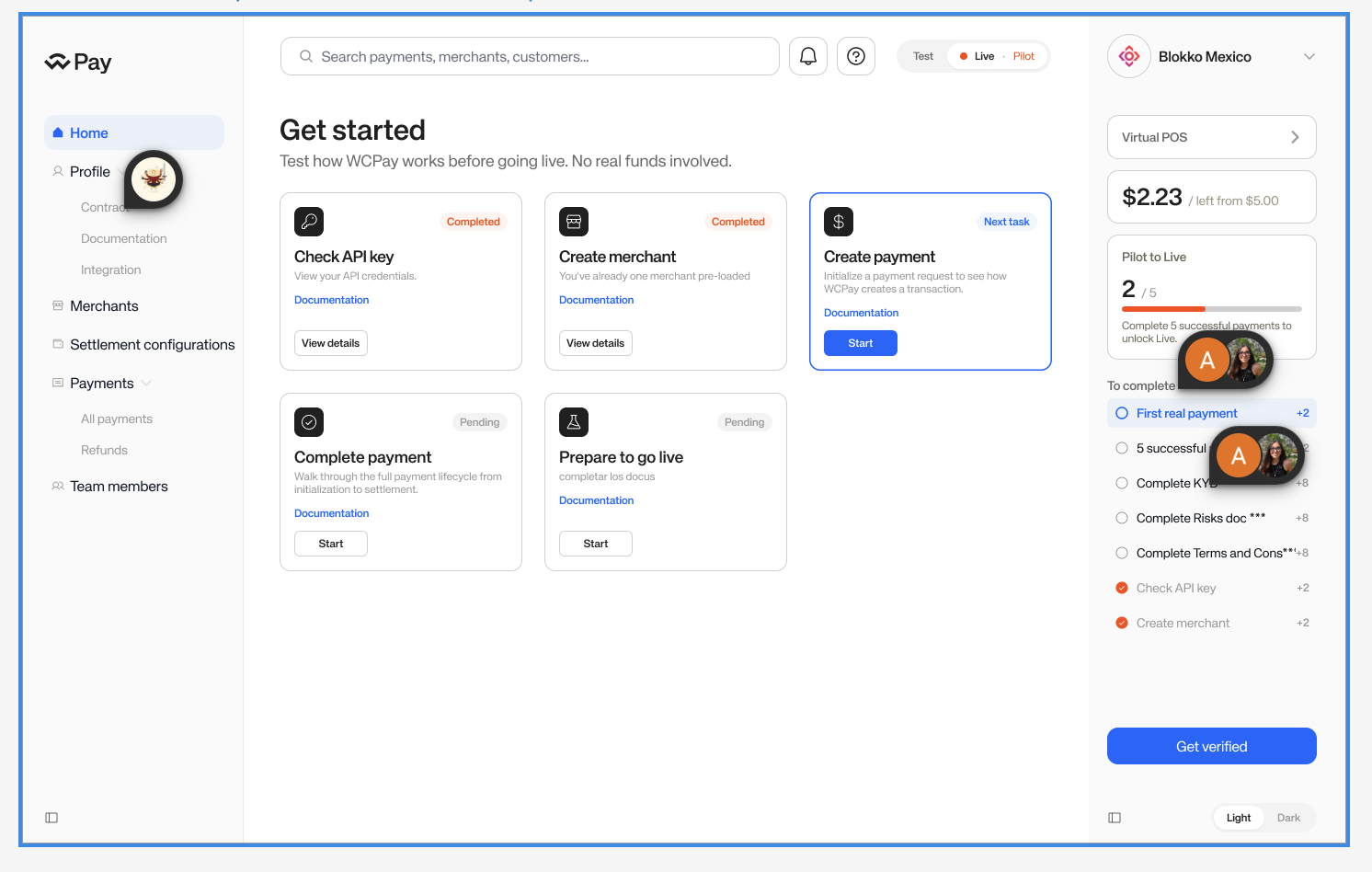
Four metric cards can create a 3+1 state

On the payments overview screen, the four metric cards are not a dynamic list. With fixed card widths, there may be widths where the layout becomes three cards on the first row and one card on the second row. We should decide whether that is acceptable, or whether the four cards should flex into four-up, then two-up.

Proposed dashboard table screen used to discuss how the grid should apply to title, metrics, and table sections.
Design question

Does every section participate in the fixed grid?

The page title, the metric cards, and the table each have different layout needs. The spec should say which grid rules apply to each section.

Current merchant details page showing merchant details and active settlement destination cards side by side.
Current app reference

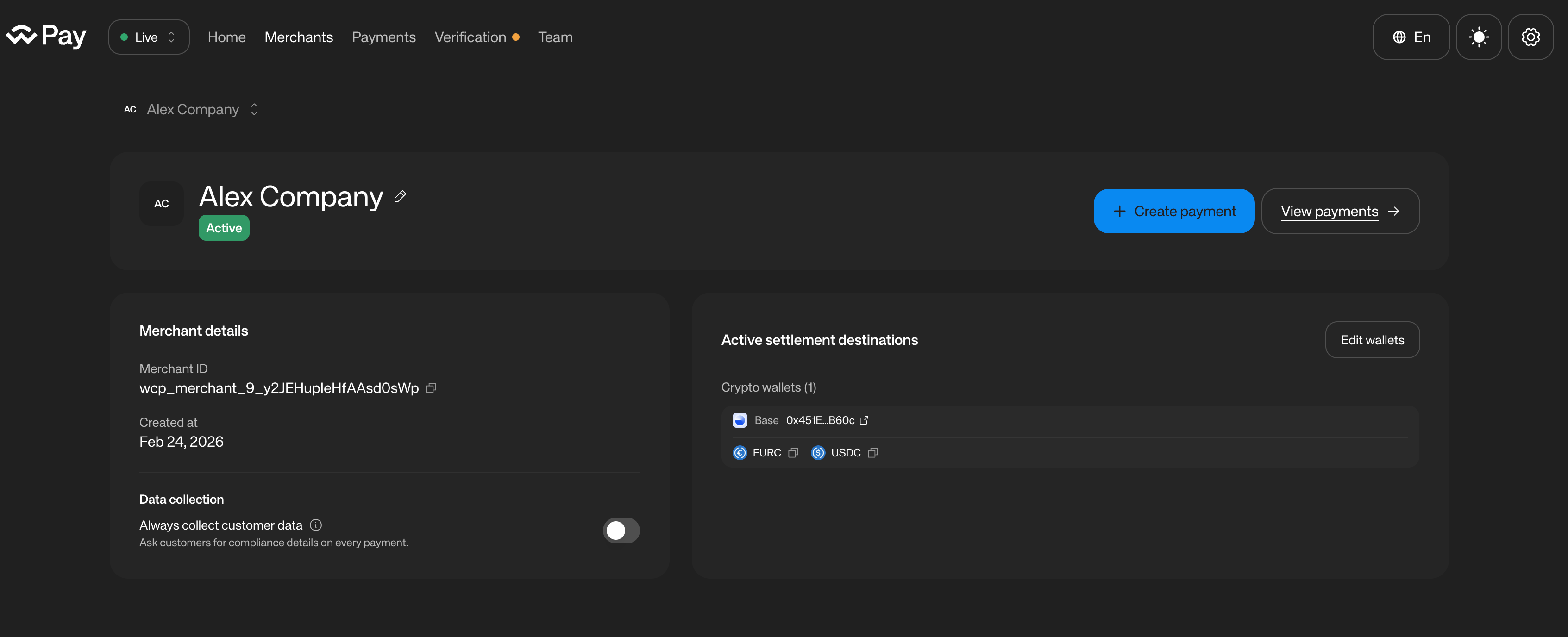
Two different-width detail panels

Merchant details and active settlement destinations currently share a row with different content density. A fixed-column model may push the second panel to a new row at tablet or small laptop widths.

Implementation edge case

Two panels are not the same as equal KPI cards

The active settlement destinations panel has wider, list-like content. If the layout system forbids dynamic card widths, we need a rule for whether these panels span multiple columns, remain fluid, or stack earlier.

This is where the grid can help if it defines spans and breakpoints. It can hurt if it only defines fixed item widths and leaves the wrapping behavior implicit.

Main screen card grid

What happens to Get Started cards on mobile?

We should define whether the Get Started cards keep using the same column-based fixed-width grid on mobile, or whether each card spans the full available width.

Full-width mobile cards are a reasonable direction and likely the more practical one. But if that is the intended behavior, then the fixed-width column grid is not the primary rule for every UI across every app and viewport. It becomes a desktop/tablet rule with an explicit mobile exception, which should be documented as part of the system.

Proposed Get Started card grid used to discuss mobile behavior for the main dashboard card section.
Mobile question

Fixed columns or full-width mobile cards?

The answer affects whether the grid system is universal, or whether mobile intentionally switches to a one-card-per-row content model.